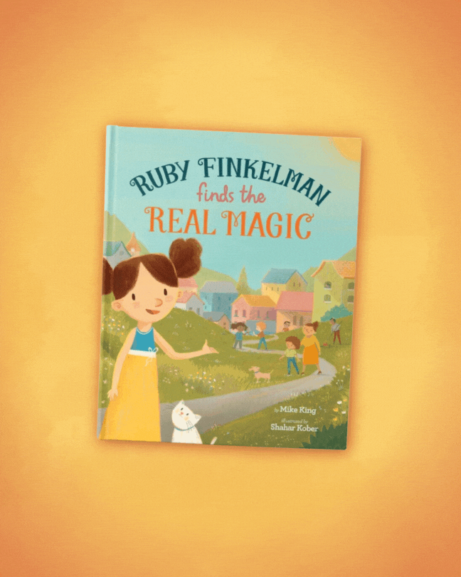
A combination campaign. This author was promoting their children’s book as well as their dental practice. As a result, I put together two different style guides for two different sets of graphics.
Despite how different the two concepts and designs were, I think they both ended up looking good.